A growth content design case study for chime
First, some background
As a person who uses financial technology every day, I know that trusting my money to a new financial service can be anxiety-inducing. And as a content designer, I’m keenly aware of how stress can negatively color perception, impair short-term memory, and degrade cognition. These impacts can cause onboarding experiences to perform poorly and can lead to users jump ship.
using content for growth
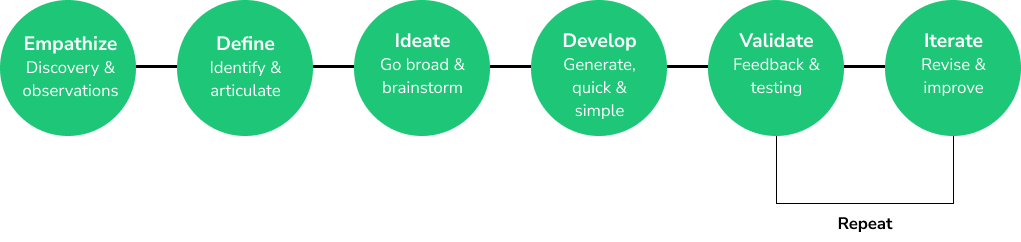
I adhere to IDEO’s Human-Centered design process, which I’ve modified to accommodate for my behavior-based approach to content. This case study will demonstrate how following the IDEO process for content can help uncover valuable growth opportunities.
Empathize
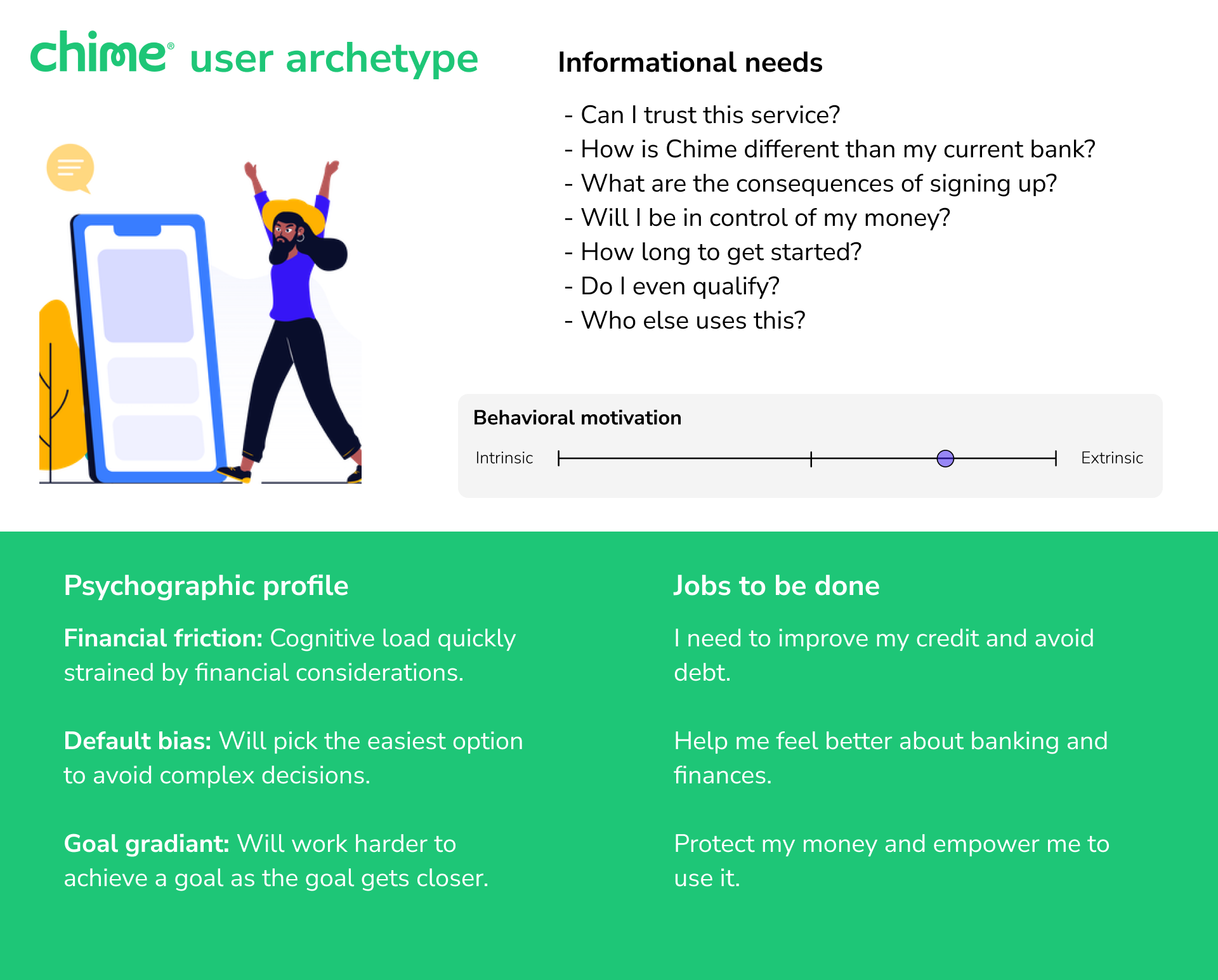
Establishing an archetype
To get started, I drafted an archetype of a potential Chime user. I relied on several signals for this archetype:
Social listening
My experience having conversations about finance with my peers
Preliminary summary, coalition, and synthesis of existing research
My own experiences as a Chime user
To be clear, this user archetype is based on assumptions and secondary research. It is not a fully-researched archetype but it will guide the early phases of my content design process.
Empathize & define
Usability testing
I sat down over Zoom with three friends who had similar attributes to the archetype I put together. My goal in these sessions was to conduct a broad exploration of Chime usability and to uncover possible growth opportunities.
I asked each subject to:
Sign up for and set up a new Chime account
Make at least one change to their profile
Explore two features of their choice
During the session, I asked subjects to speak their experiences out loud and provided neutral prompts along the way, such as asking, “what makes you say that?”, “what would you expect to happen?”, and “what feelings does that inspire?” I recorded the Zoom sessions for later analysis.
pain points and content considerations
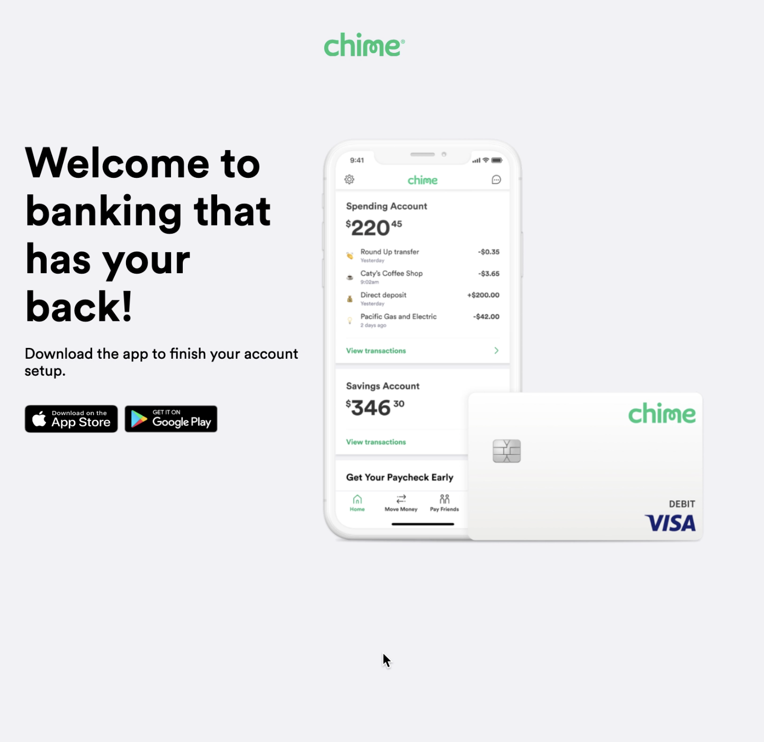
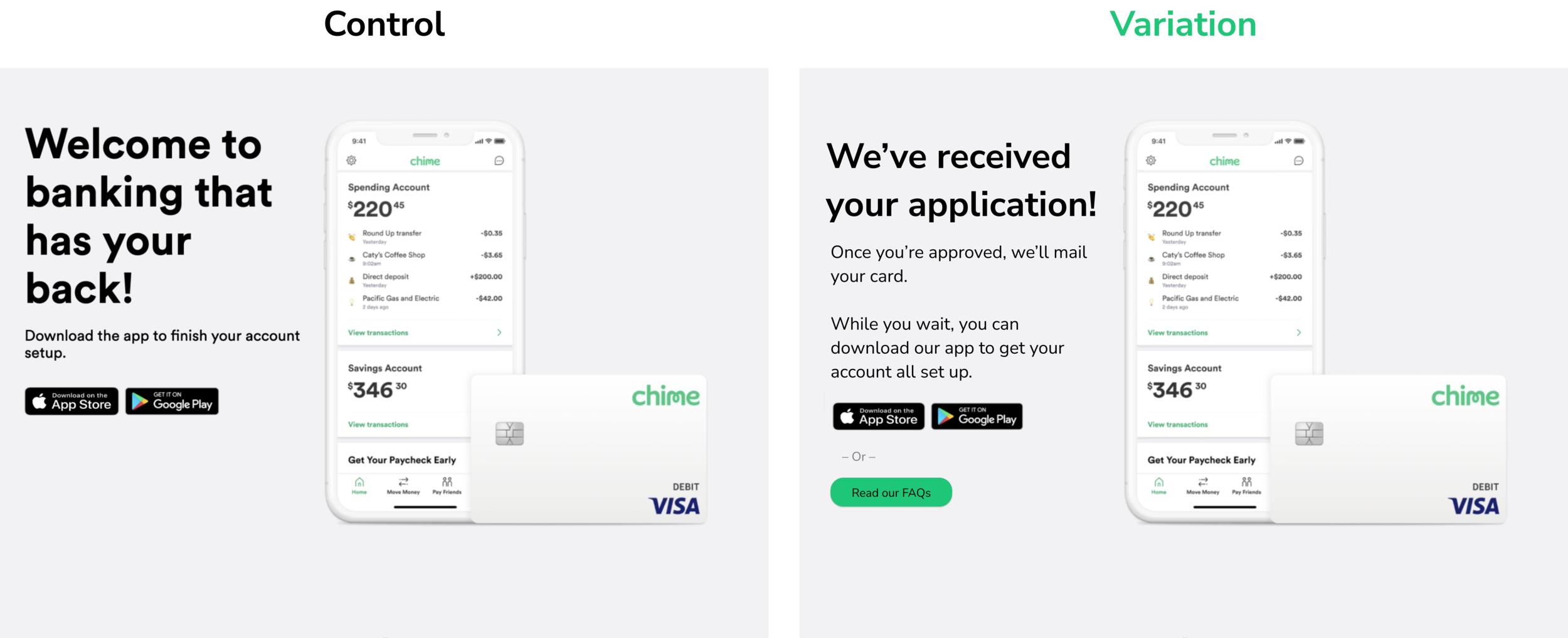
1. Download the app: “dead end” account set up experience
The set up flow is interrupted by a fullscreen prompt to download the app, which subjects reacted to as a barrier to completion or dead end in the experience.
Quotes
“I guess I have to get out my phone and install the app now?”
“All I can do is open the app store, but I’m on my laptop.”
“They drop me here. Am I done?”
Content design considerations
Confirm that the application has been submitted, provide sense of progression
Create a sense of continuity and momentum by providing a pathway that adheres to the voice and tone established in set up.
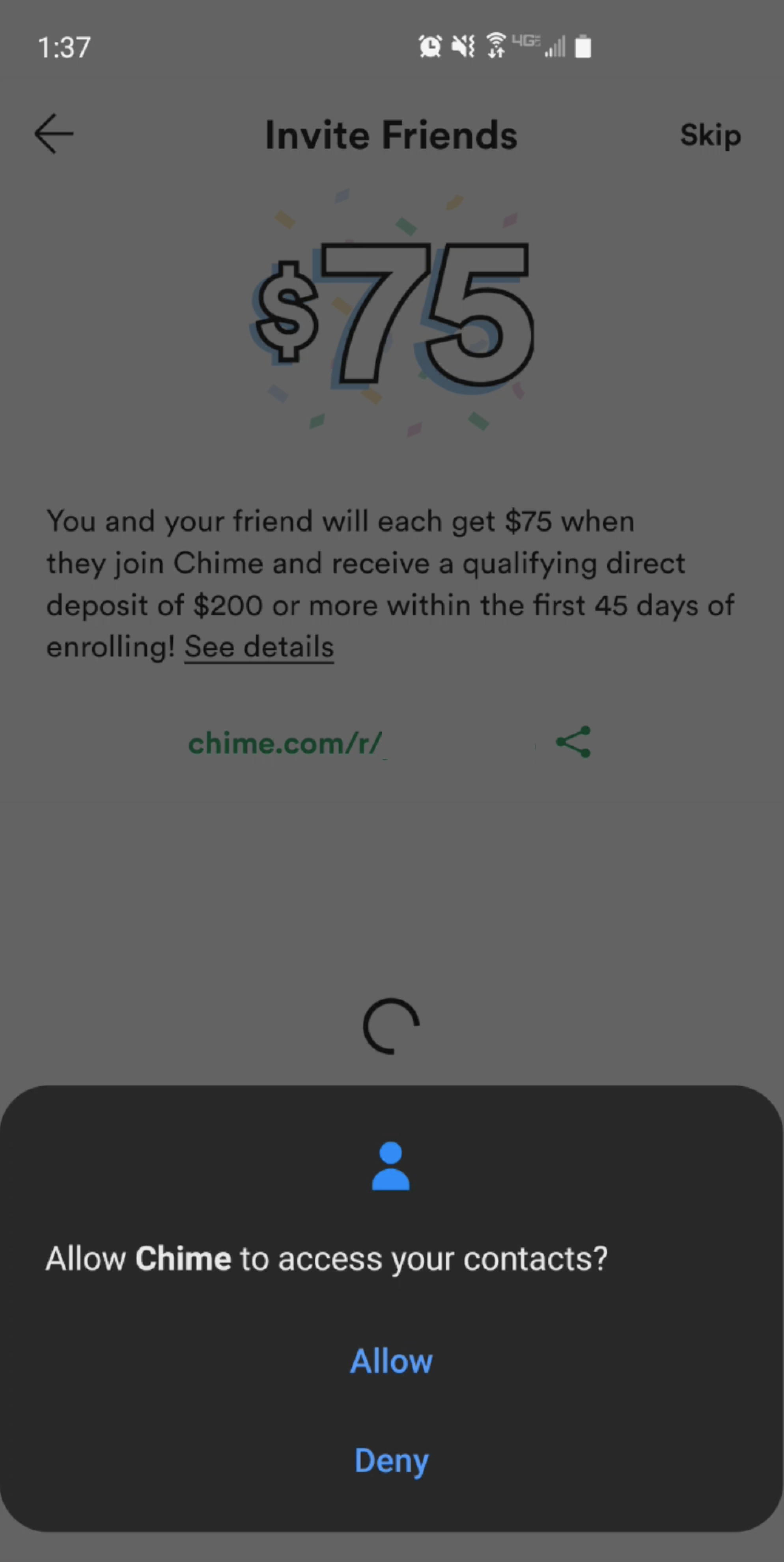
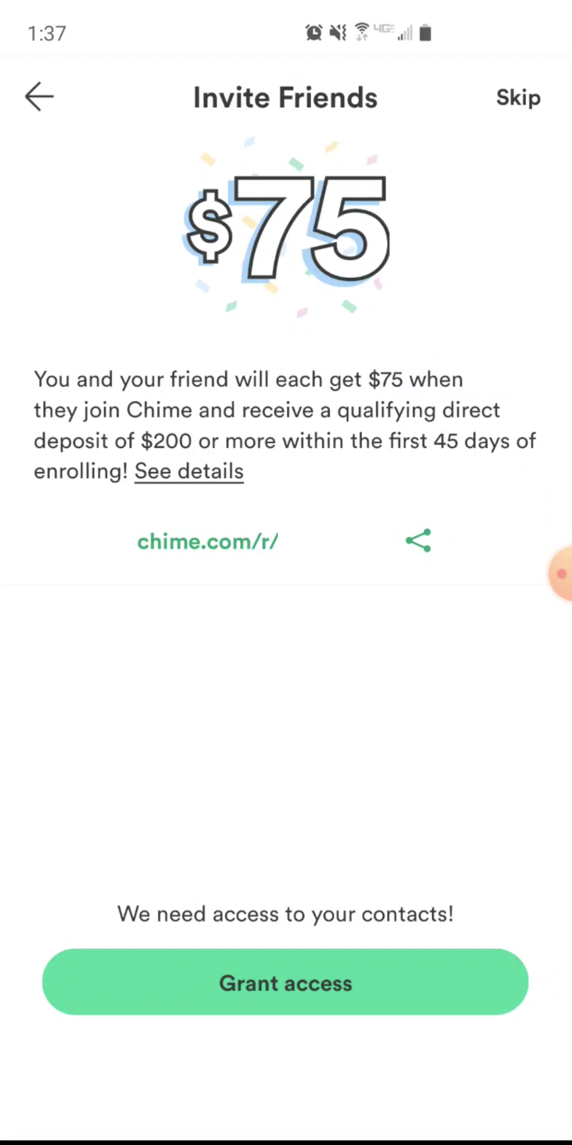
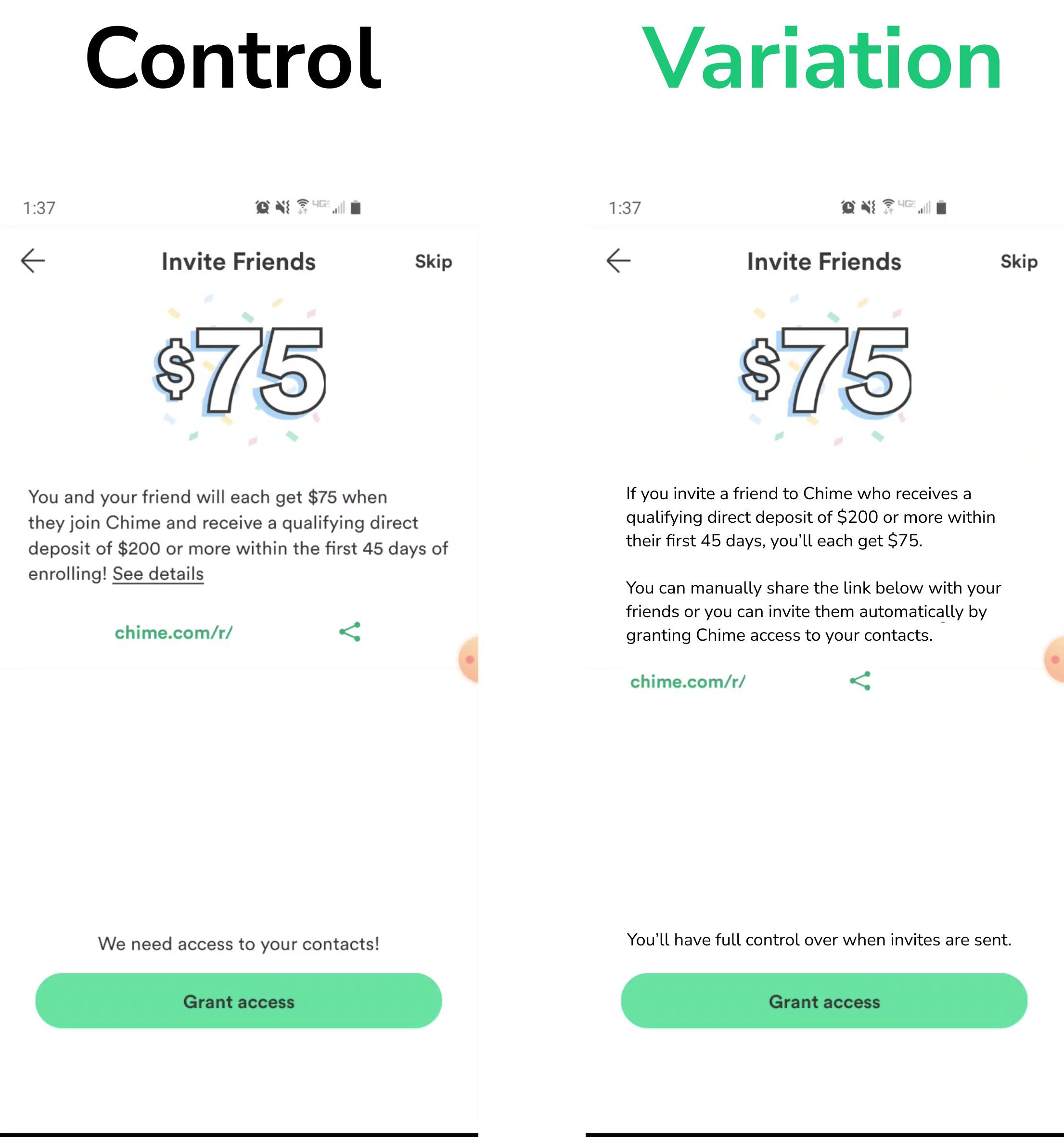
2. Invite friends: Low motivation, heightened privacy anxiety
Test subjects expressed a lack of interest in the financial incentive to invite friends and noted their anxiety around giving Chime access to their contacts.
Quotes
“It’s asking for my permission but I don’t think I’ll give it. I doubt I’d ever get this reward.”
“Does it really need my contacts? I worry that it will spam everyone I know on my behalf.”
Content design considerations
Permission priming may alleviate anxiety.
Exclamation point in “We need access to your contacts!” carries negative emotional charge.
In addition to financial incentive, endowment effect may increase motivation to give permission.
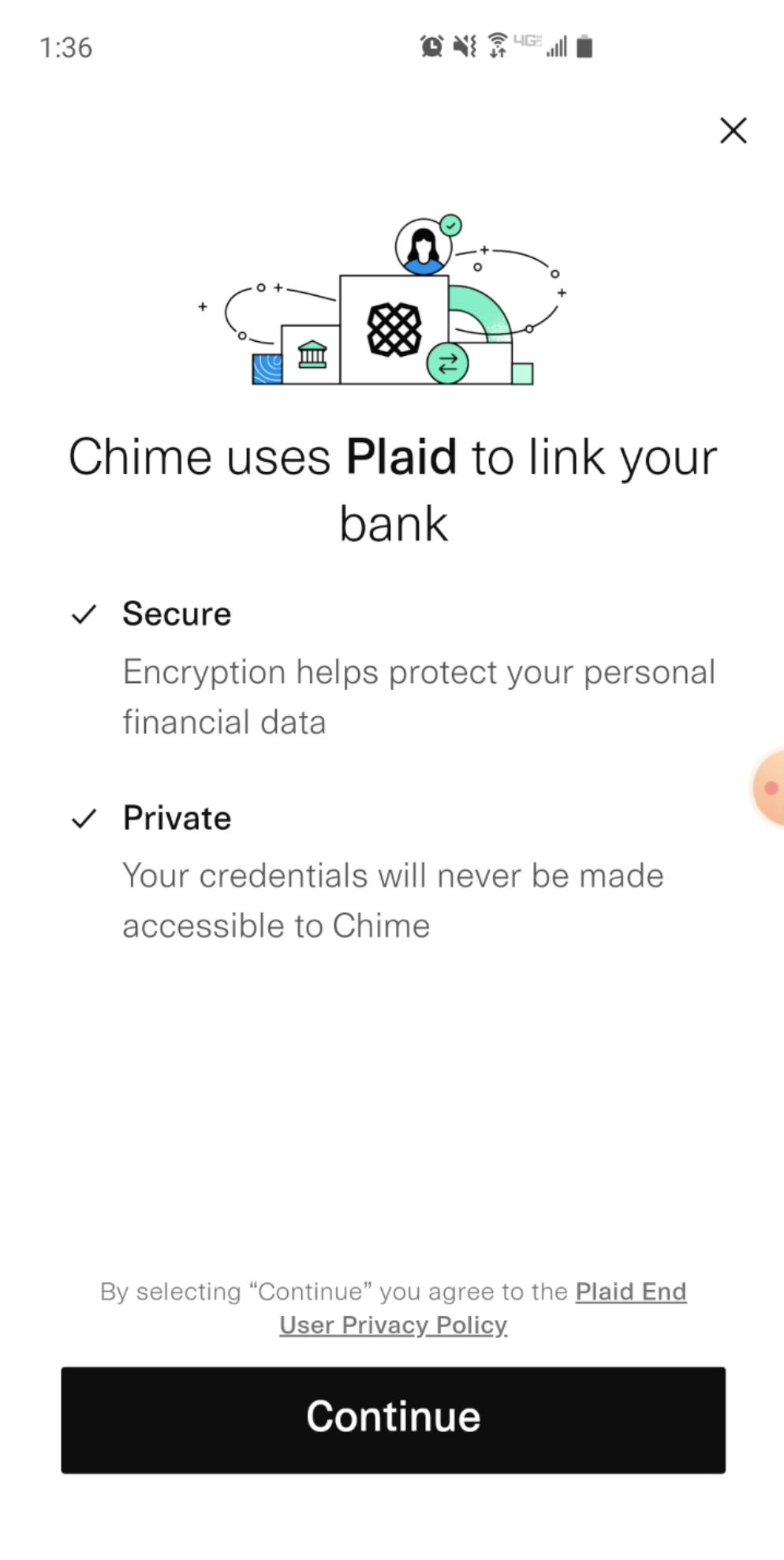
3. Linking a bank account: content needs mismatch
When encountering this Plaid-based bank account linking screen, test subjects indicated that the relationship between Plaid and Chime was unclear and that information available didn’t feel relevant.
Quotes
“It looks like I’ll have to create an account with Plaid if I click ‘Continue’ but I’m not sure.”
“So Chime uses this service to connect my account. I’d like to know more about Plaid if it’s handling my bank information.”
Content design considerations
Headings that relate directly to a third-party connection may help users form a 1:1 map to their informational needs.
Primary call-to-action copy should more clearly describe the consequent state.
Heading or body copy should explain how the Chime/Plaid integration may impact the user.
Ideate
In this phase, I continue my exploration by surfacing many possible solutions to the pain points discovered in testing. The more, the merrier! From the many solutions, I looked for those that would have the highest and easiest-to-measure impact.
Because I’m not working with a design team on this exercise, I relied on some behavioral design frameworks to guide my selection process.
Fogg Behavior Model
The first framework I focused on was the Fogg Behavior Model, which provides a solid foundation for growth content design because of how each of the elements in its equation can relate to language. It also ties in to actionable behavioral economic principles and feels especially relevant for new user experiences on Chime where there is a significant trust and anxiety barrier to overcome.
B = MAP
Behavior =
Motivation (the willpower to take action)
Ability (the capacity to take action)
Prompt (the push to make it happen)
The Fogg model holds that users will perform a target behavior when there’s adequate motivation and ability for a prompt to succeed. In the context of this case study, test subjects indicated that either motivation or ability were insufficient to prompt a target behavior.
Perceived value
The second framework I decided to focus on is the perceived value formula. It holds that the perceived value of an experience is equal to the experience’s expected utility minus its expected interaction cost. Think about how before someone can actually read words on a screen, they arrive at a perceived value by scanning the content’s structure.

To get a grasp on perceived value, consider the difference between a packed souvenir store and a curated museum gift shop.
In this analogy, the expected utility of the souvenir shop and the museum shop is more or less equal. But the souvenir shop requires a higher interaction cost to find what you’re looking for. This interaction cost results in a slightly lower perceived value. The museum shop has a curated, sparse selection of items, contributing to a higher perceived value.
With these strategic frameworks in mind, I selected three experiments that mapped closely to my proposed content design strategy.
📓
To learn more about my growth content design approach and some of the behavioral frameworks I rely on, take a look at the article I wrote for The UX Writers Collective.
develop: Experiment paths & content design provocations
1. App installation: confirm application before prompting app download
Hypothesis
We believe that confirming submission of the user’s application for an account before prompting them to download the app
will result in an increase in day 1 active users
because users will feel motivated by a mindset of progression and continuity.
funnel metrics to watch
App store link click from confirmation page
FAQ link click from confirmation page
Confirmation page bounce rate
Average time on confirmation page
2. invite friends: clarify consequence of contact permission & emphasize social proof
Hypothesis
We believe that alleviating ambiguity about what Chime will do with a user’s contacts
will result in an increase in the number of new users who approve the contact permissions request
because users will perceive a smaller barrier to acting.
funnel metrics to watch
Skip rate
Referral link copy
Bounce rate
Grant access button click
Permissions approved rate
3. COnnect bank account with plaid: explain consequent state and create “connection” mindset
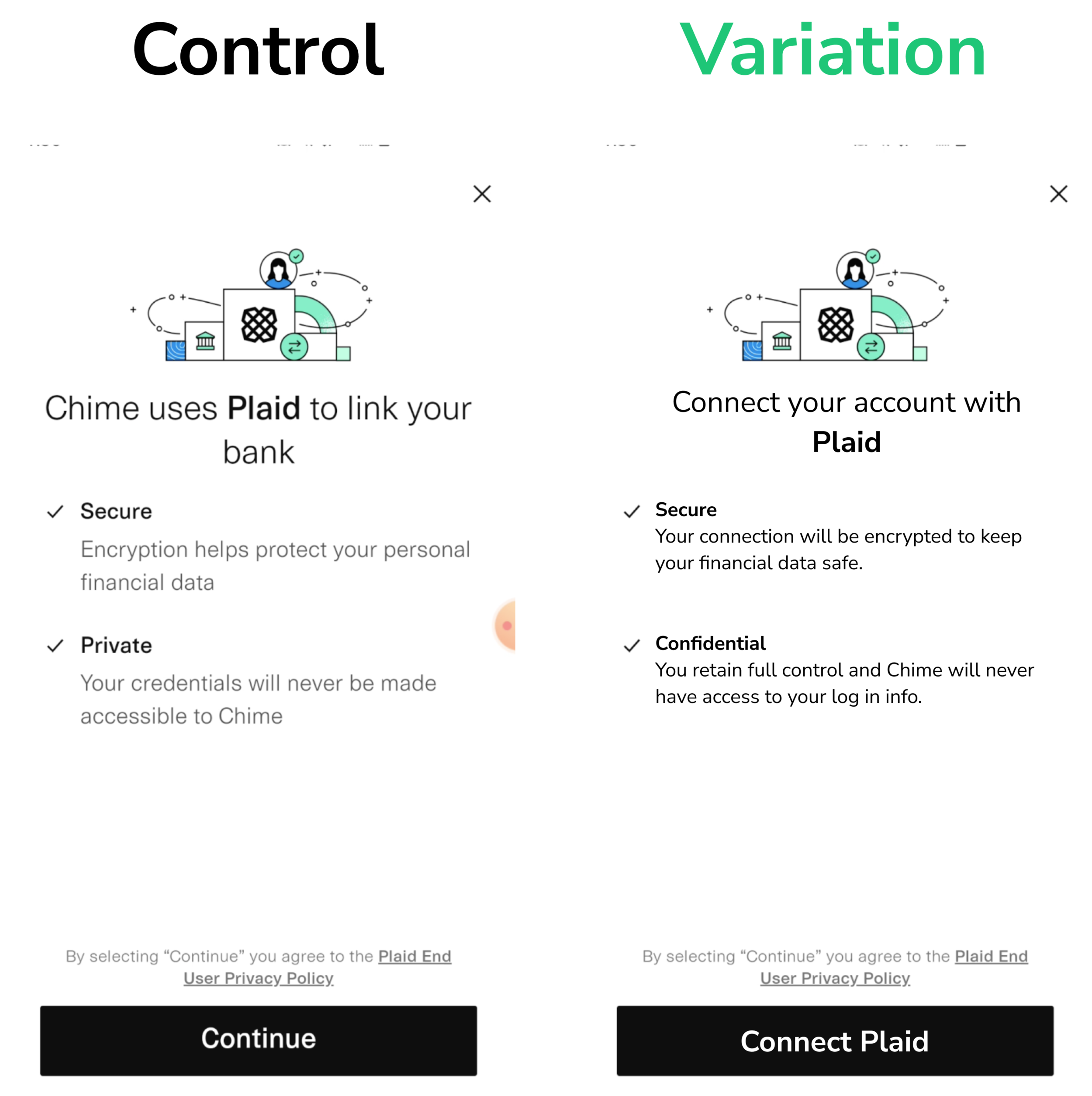
Hypothesis
We believe that framing the security and privacy of Plaid as elements of a consequent state
will result in an increase of Plaid-enabled accounts
because users will perceive the security and privacy of connecting with Plaid as benefits of using Chime.
funnel metrics to watch
Bounce rate
Average time on screen
Privacy policy clicks
“Connect Plaid” clicks
Accounts connected
Validate & iterate
I’ve made a lot of assumptions in these experiment provocations, and my understanding of system constraints, legal obligations, and voice and tone guidelines may need a bit of fine-tuning.
To account for my lack of subject matter expertise, my next steps in this growth content design process would be to:
Lead a critique tour to curate feedback from product and leadership stakeholders.
Run a 5-second comprehension test of all proposed variants to ensure content aligns with user expectations.
Iterate on content design based on data collected from validation.
Collaborate with design, product management, and engineering to build experiment, launch, and define post-analysis plan.